6

After gathering your feedback and doing some research, I have spent some time working on the design for the site, and I am excited to share the result. Hope you like it, and I look forward to your feedback!

Bitcoin site design

The design is based around the universal bitcoin symbol and the lightning network, which is one of its most iconic characteristics. The Bitcoin logo was slightly modified to be unique to the site but still distinguished as the bitcoin logo everyone knows. The lightning network and blockchain is represented in the background as a simple connection of dots that can be representative of nodes.

Color scheme

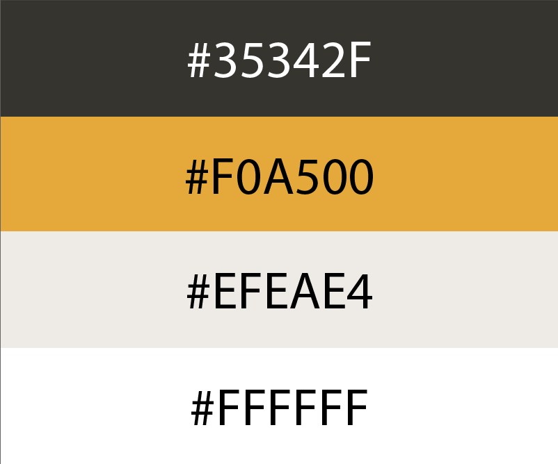
The colors chosen are a palette inspired by the Bitcoin Orange.

Proposed color scheme for Bitcoin Stack Exchange site design, incorporating 4 colors: #35342F (very dark gray), #F0A500 (orange), #EFEAE4 (alabaster/light brown), and #FFFFFF (white).

Logo

As mentioned before, the logo is a slight variation from the universal logo paired with the Bitcoin title that uses Poppins Semibold as the font. A font that is geometrical and clean.

Proposed logo for the Bitcoin Stack Exchange site, as described above. It features a vertical Bitcoin logo (consisting of a white design in an orange circle) as the icon; to the right of it is the text "BITCOIN" in all-caps in the Poppins Semibold typeface.

Favicon

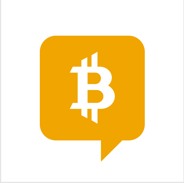
Proposed favicon for the Bitcoin Stack Exchange site. It features a vertical Bitcoin logo inside an orange speech bubble.

Page Design

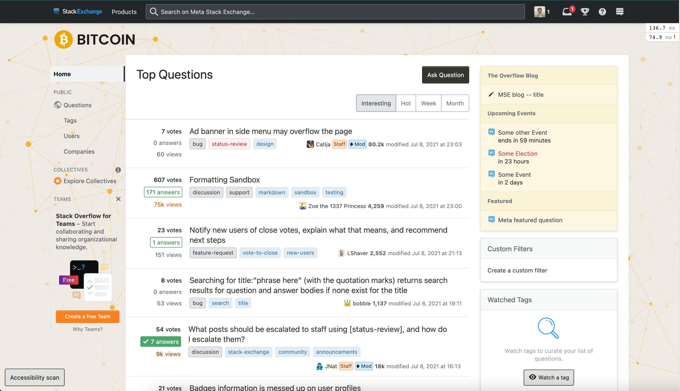
Proposed page design, showing the site's home page. The design appears as described in the "Bitcoin site design" section above. The background of the page is in a light brown, with a networked pattern of orange dots connected by lines overlaid on it.

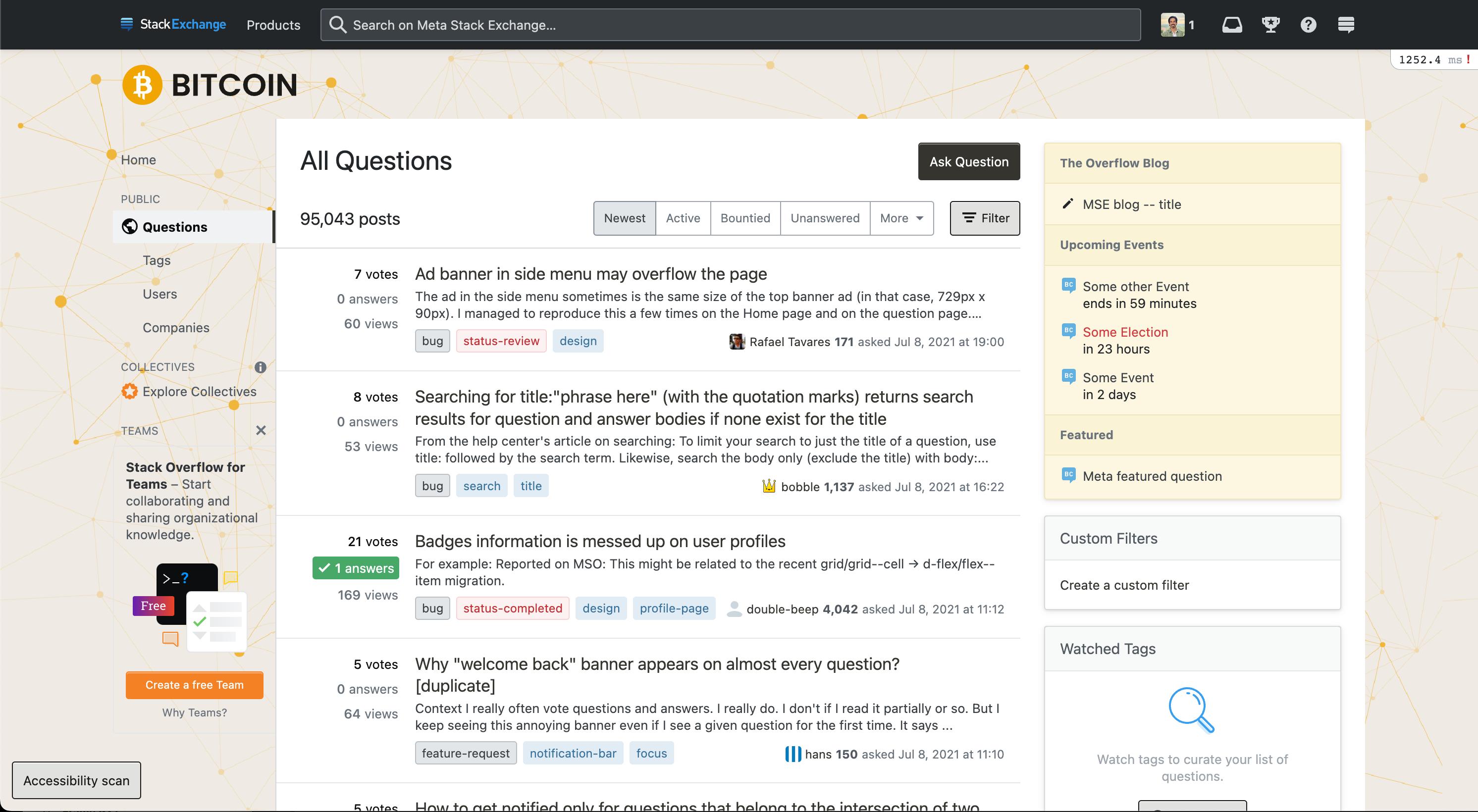
Proposed page design, showing the site's Questions page (/questions). The design is largely the same as the above, except this page includes excerpts of the questions.

We hope you enjoy this design, but if something doesn’t feel right, now is your chance to share your feedback. This window for feedback will be open for one week. We will then work to incorporate feedback as best as we can, finalize things on our end, and lastly, deliver the design to your site.

4
  • Hi V2Blast, Catija, and Jose, I was just wondering whether you had an update on the status of this project and whether there was something else we could do to help.
    – Murch Mod
    Commented Jun 13, 2022 at 16:08
  • Hi all, any update on this? Commented Aug 14, 2022 at 16:28
  • 1
    Sorry for the late reply. We are expecting the new theme to be live next week. I appreciate the feedback given and patience.
    – J.S Staff
    Commented Sep 9, 2022 at 19:30
  • Update: Your new site design is live!
    – V2Blast StaffMod
    Commented Sep 16, 2022 at 19:06

4 Answers 4

9

I agree with not altering the logo too much as it could be mistaken for an altcoin. Background looks good.

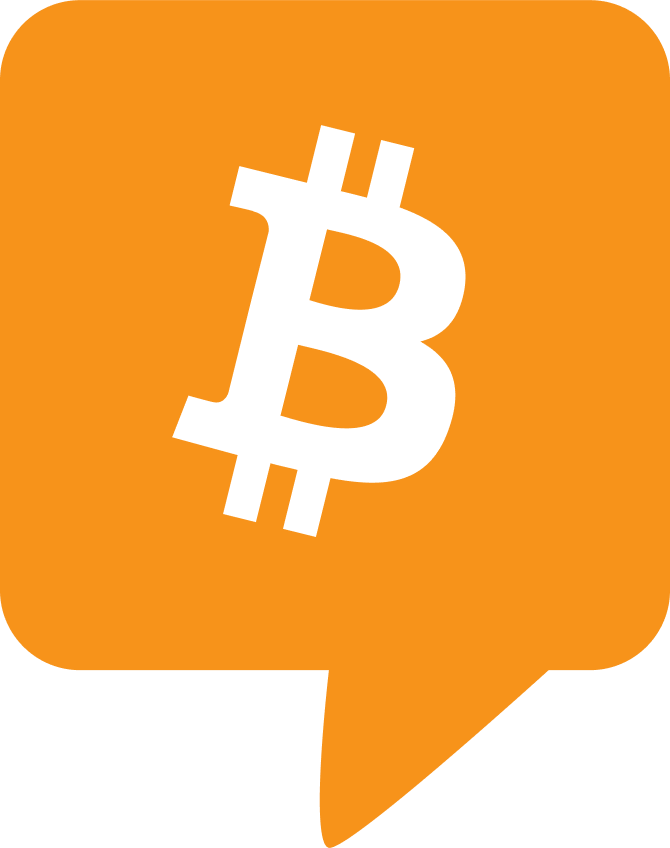
Sticking with the original #F7931A orange and 14 degree tilt inside a speech bubble is my suggestion.

Made a quick mockup below:

enter image description here

The SVG file Stephen's shared above is outdated and has some minor issues with the vector so I made a Figma file that has updated assets for the original bitcoin logo (not just the icon but also the wordmark and "B" on its own).

I detailed what very slight alterations I made in the File. I also included my mockup above if you wanted to use / modify it - it's all yours!

Figma file: https://www.figma.com/file/zMyIHY7iGVTpP8uc7prM5x/Bitcoin-logo?node-id=1%3A6

You can DM over at the Bitcoin Design slack mentioned by Murch if you need any help / feedback.

5

Thanks for taking the time to build a custom branding for the Bitcoin Stack Exchange! Here are some thoughts on logo and background.

Logo

I would suggest using the Bitcoin logo in its proper form, meaning #F7931A orange with a 14 degree tilt. You can find the SVG file for this here. https://bitcoin.design/guide/getting-started/visual-language/#update-by-bitboy

In my opinion, there's nothing wrong with modifying the bitcoin logo when you are trying to conform it to an existing brand. But there isn't really an existing brand for Bitcoin Stack Exchange, so making modifications to it seems a little arbitrary in this context.

The way that the tips of the B have been extended and sharpened looks very harsh. They remind me of daggers or knives. It looks very dangerous and unfriendly. Since many in this community see bitcoin as the most open monetary network on the face of the earth and a beneficial technology for humanity, it makes more sense for the bitcoin logo to appear more friendly. Therefore, best to use the original logo in this situation.

Speech bubble logo

I think the speech bubble logo is a good idea, but I'd recommend using the original Bitcoin B, tilted and with the proper orange.

Background

We can say it represents a network of bitcoin nodes. It looks very standard B2B technology stock imagery, but it will get the job done.

Maybe try lightening background very slightly, or darkening text? Technically, the colors pass WCAG AA and AAA a11y requirements, but for some reason when I eyeball it just looks a little low-contrast. That might just be me. Not sure if others feel the same way. https://webaim.org/resources/contrastchecker/?fcolor=61605C&bcolor=F0EAE3

4

I don't have much of an eye for design myself, but when I had a look at this draft, I had a few concerns. The Bitcoin Logo is usually slanted 14° clockwise. There is a forkcoin of Bitcoin, essentially a scam, that uses an upright ₿ on a yellow background for its logo. The main color of the proposed scheme falls somewhere in the middle between Bitcoin Orange and that forkcoin's color.

The logo itself feels a bit too customized. Since there are scores of Bitcoin copycats, it might be better to stick closer to the original logo.

I asked a befriended member of the Bitcoin Design community for her thoughts. She provided the following questions and comments:

Bitcoin site design

Is the site design based on technical execution? I like that there is inspiration from a branding standpoint but I wonder if UX/UI strategies are considered.

Color scheme

Is this accessible? Has it been tested? Iterating on Bitcoin Orange is an interesting idea but I am not sure these colors meet web standards. This new Bitcoin Design Accessibility page may be worth consideration.

Logo

If the plan is to go for geometrical and clean, this logo needs a bit of tweaking. Bitcoin icons has been polished and may provide more of the desired look and feel for this logo. There are github and figma environments to build and share.

Page Design

Readability is a challenge. More space and visuals to communicate would offer a much smoother user flow. It would be useful to see flows and wireframes. From the screens shown it isn’t clear how different personas may interact and make sense of the site. Bitcoin UI Kit could be the best tool for the job here.

She also invited you to join the Bitcoin Design Slack, if you wanted to bounce a few ideas around, and suggested that probably a few of the 3,000+ members of the Bitcoin Design Community would be excited to help the effort.

2
  • 1
    As a non-designer, it reads that the response in some cases (e.g. page design) don't relate to the design/artwork itself, but rather to the layout of our platform, which this design is not touching. Is it possible to clarify whether these points are about the artwork before/after rather than about the entire layout of the page?
    – Catija StaffMod
    Commented Jun 3, 2022 at 20:40
  • 1
    Sorry, I may have initially failed to convey that the layout is mostly fixed, but only the color scheme and artwork are up for a do-over. My friend thinks that "using bitcoin design icons and changing the logo could be the easiest wins here". The linked Bitcoin Icons are open source, free to use, and under an open license. If your designer were interested, she'd be happy to help "jam it out on figma sometime".
    – Murch Mod
    Commented Jun 3, 2022 at 20:57
4

I'd like to echo Murch's concerns about the logo stylization in this draft. As a site devoted to technical Q/A help, I feel that we should stick to the well-adopted open-source standards, rather than trying to break the mould with something novel/fancier. Specifically:

  • I agree that including the 14° clockwise tilt is highly preferable, and also important in regards to maintaining a distinct brand amongst the many imitators/scams.
  • Likewise, keeping the 'orange' colour in the colour palette as close to #F7931A as possible is preferable to differentiate against imitators/scams.
  • The angled ends on the vertical and horizontal lines extending out of the 'B' look odd to me, and break away from the normative design. I think sticking to flat ends is highly preferable (for the vertical lines, at the very least).

On the positive side, I really do like the connected dots in the top left, I think they are a simple but effective element that represents the P2P nature of the Bitcoin network well.

Thank you for your work on this, I am excited to see the final product.

You must log in to answer this question.

Not the answer you're looking for? Browse other questions tagged .